The Uni agency actively strived to help the betterment of the emergency services. Through this collaboration, a brand new app was created allowing the emergency operators to treat calls more efficiently. From now on, the user can start a video call, allowing the service to be able to have a visual on the situation, becoming more efficient at treating emergencies.
Urgentime
START UP / BRANDING
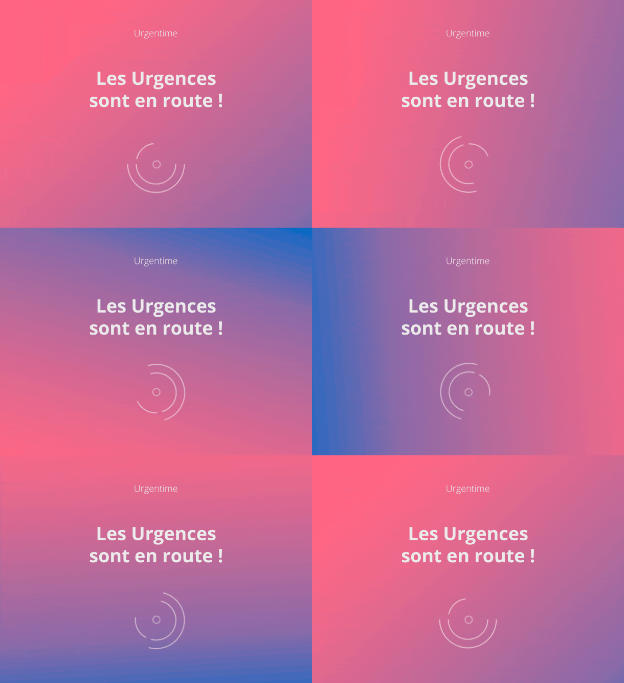
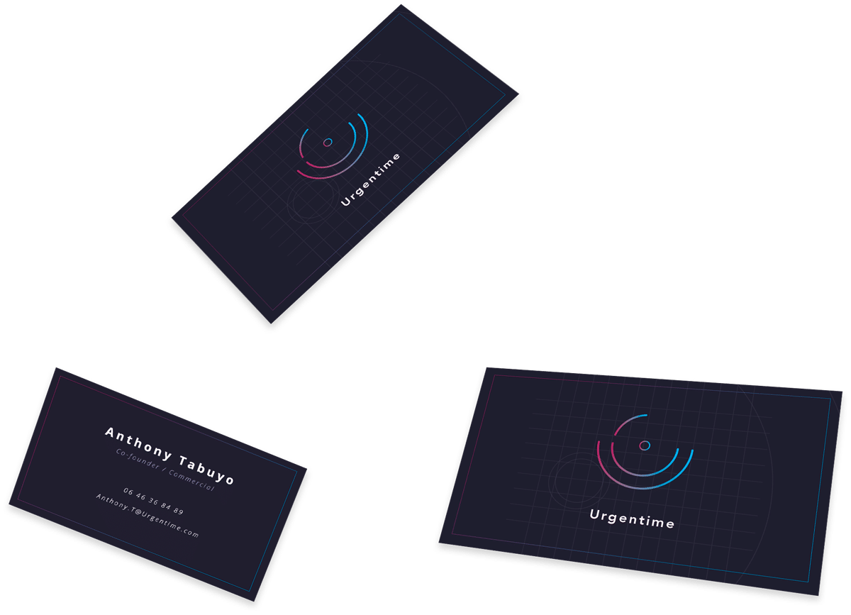
The Logo
GRAPH CHART

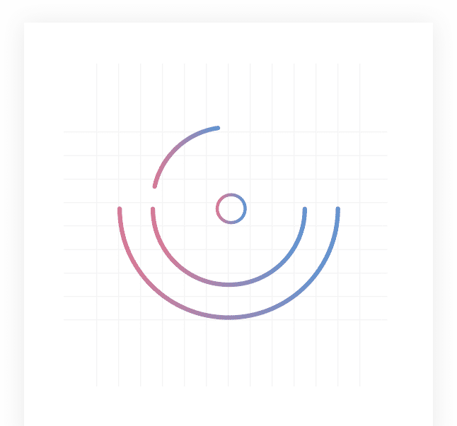
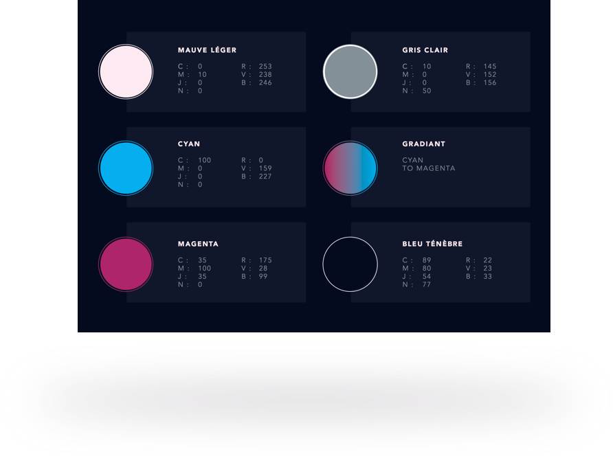
Colors
The gradient symbolises the transition process between levels of emergency, (Hot and vivid colors).
Up until the threat has been dealt with (blue cold and calm colors).
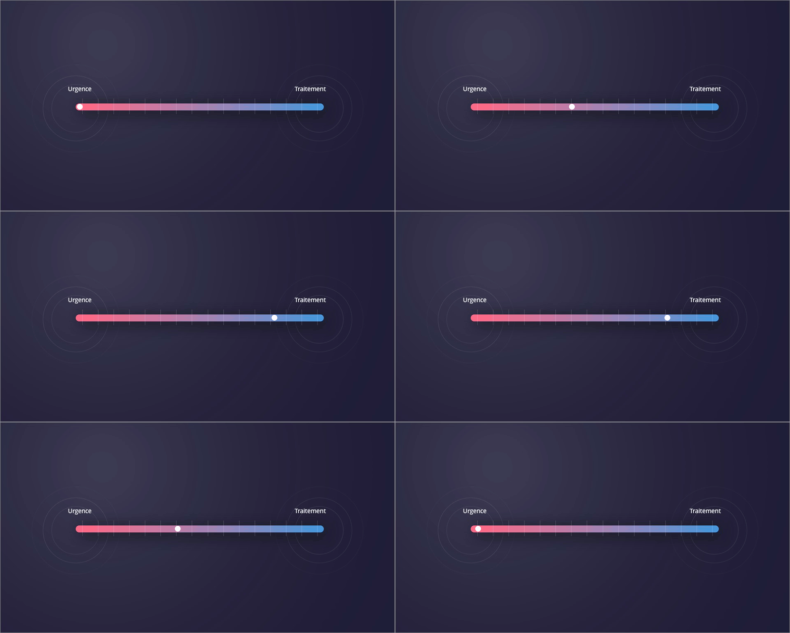
Illustrations
We created the graphic elements of communication, bettering the visibility of the start-up.
