';

Charles Jourdan

CASE STUDY

Charles Jourdan

FRENCH CRAFTSMANSHIP REBORN

Created in the early 20th century, Charles Jourdan is an iconic and luxurious French shoemaker. The brand became famous in Louis XV, in 1960 the brand produced over 650,000 peers a year. This was the first day of the year French shoemaker. Charles Jourdan became famous due to his court shoe with a low cut front named “Louis XV”, in 1960 the brand produced over 650.000 pairs a year. This was the golden age of the brand as it soon fell due to conflict of interest within the heirs, when it was forgotten, it took until 2009 to see its glory.

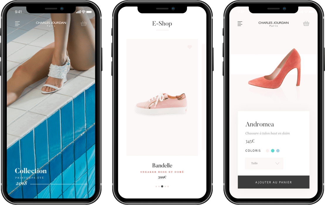
In the context of that rebirth, the brand has decided to open an online store. To direct its creation and design Charles Jourdan selected the Uni agency, specialized in digital luxury.

The challenge: Making a unique platform that respects the rich history of the brand while pointing out its new and modern style.

00

Preparation

MEETING CLIENT EXPECTATIONS

Meeting client expectations

The first step was to clearly define the brand’s needs and where it wanted to go with the creation of its online store. To achieve this, we met with the directors of marketing. The aforementioned directors informed us about the brand’s history and why it is a crucial aspect of the brand image, iconic in it’s time, we then keep this in mind when creating a modern website that maintained a level of originality.

Defining objectives

Our strategy includes a number of targets to hit when creating and publishing an online shopping platform. With that in mind, we were able to determine 4 key objectives.

  • Creating a digital storefront
  • Developing the brand online
  • Increase traffic and popularity
  • Recruit new clients

Planning the project

To reach our goals, we had to define the different steps in our delivery so that the directors of marketing and the project head get a good vision of our creation.

  • UX design
  • UI design
  • Prototype creation
  • Prototype delivery

After the validation of our planning phase we then establish a quotation for the client.

01

UX Design

FOR AN OPTIMAL EXPERIENCE

So that the interface stays intuitive and functional, it became necessary for us to start thinking about the design aspect for the website ahead of time to make sure the user experience remains at an optimal level.

A Cooperation workshop

While collaborating with the project head and the marketing directors, we defined different essential points with them, cooperating directly with our creative team to make sure that the final product is satisfying.

FEATURES

Figuring out what functions will be available on the website like, how is the client giong to see this? Where to put this so that it can be accessed easily? And which function can be removed to make the design simpler and more intuitive.

ERGONOMICS

Creating the site with the user experience in mind, making it legible and intuitive on any device and platform like a tablet, desktop or mobile.

USER NAVIGATION

How is the user going to react when faced with different functions available, on which CTA (call to action) is he going to click, which information does he want to know when buying or when making his choice. This is the user navigation and understanding and predicting it is key to a legible and intuitive platform.

Conception of the sitemap

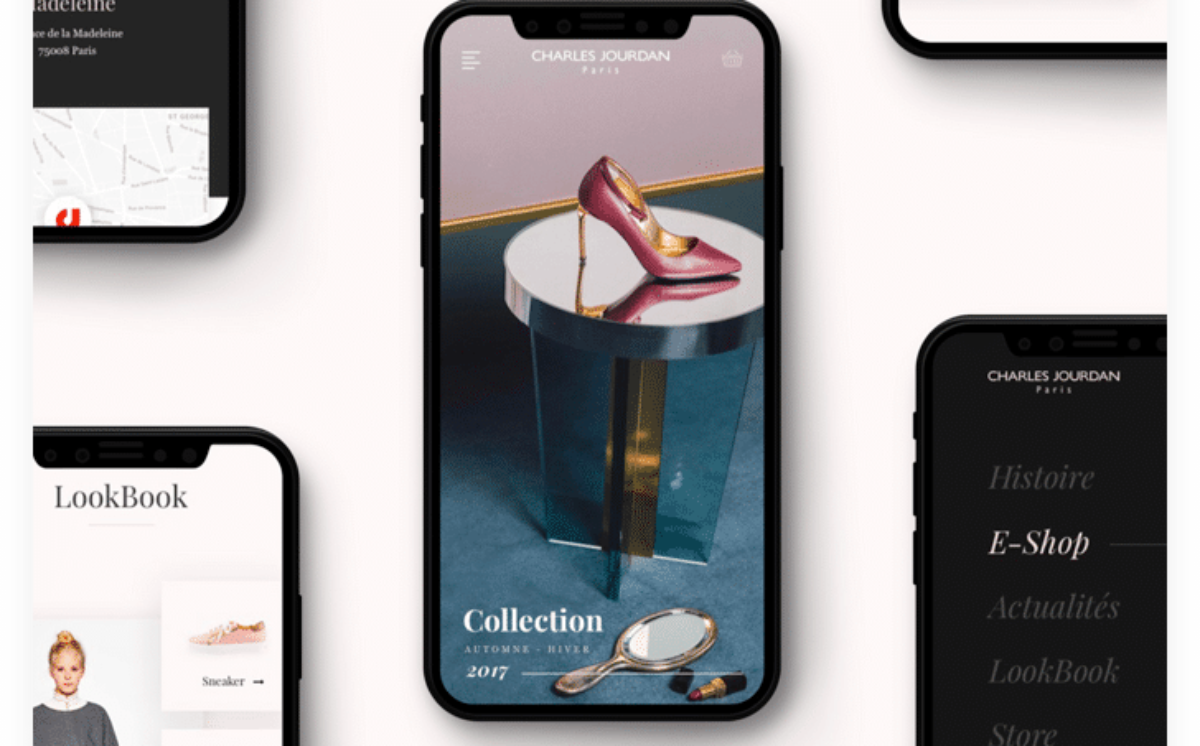
The user navigation analysis done, we can define all of the functions that the website is going to need. This next step is going to unify them under a large tree-like structure, branching out from a core in a pattern that will allow us to have a full view of the website’s navigation to understand and customize it better.

Functional simulations using wireframes

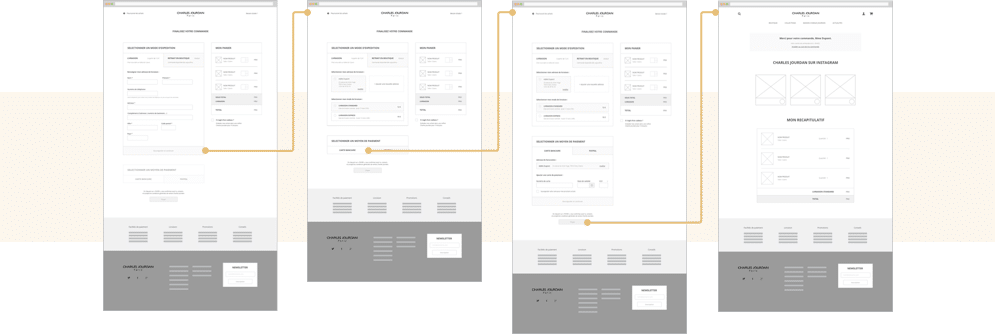
To create the different interfaces of the website we carry on using wireframes. Like a model, we structure the different parts of the website with it. This step is crucial, as it makes the website more ergonomic and legible, we then send these wireframes to the client to make sure that they find it satisfying.

Cross-platform optimisation

The website being available on multiple supports, we had to think of the different ways clients may use the websites and on what platform when creating said website, so that its use can be optimal regardless of supports.

02

Art direction

THE CHARLES JOURDAN AESTHETIC

The creation of the design in accordance with the brand’s graphic chart.

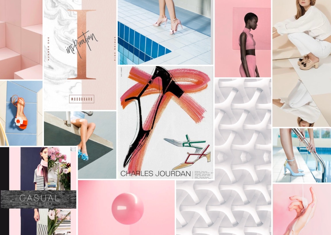
Creation of graphic research boards.

Each one of them follows its own aesthetic conception through different graphic elements, (photography, drawing, etc..). This step is done by keeping in mind the spirit of the visual identity of the brand like Charles Jourdan. After that we submitted different works following these instructions to allow the client ot make their decision.

Flattering the product through visuals

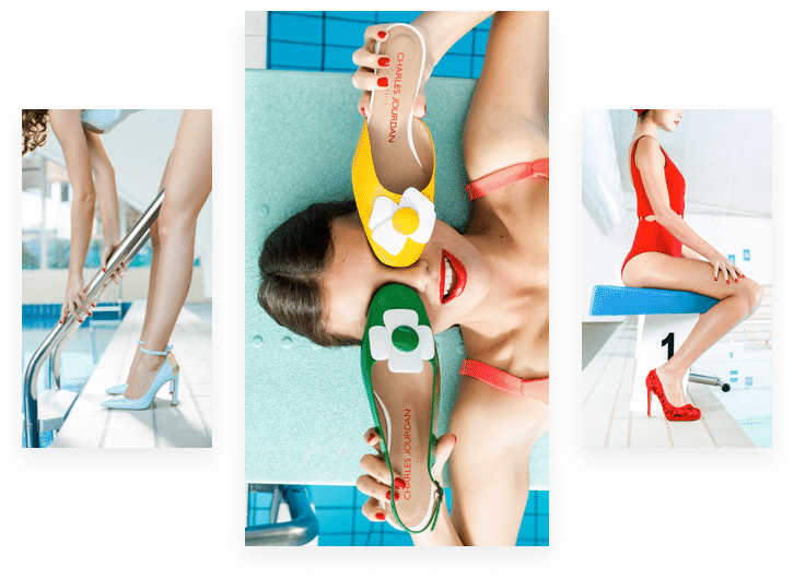
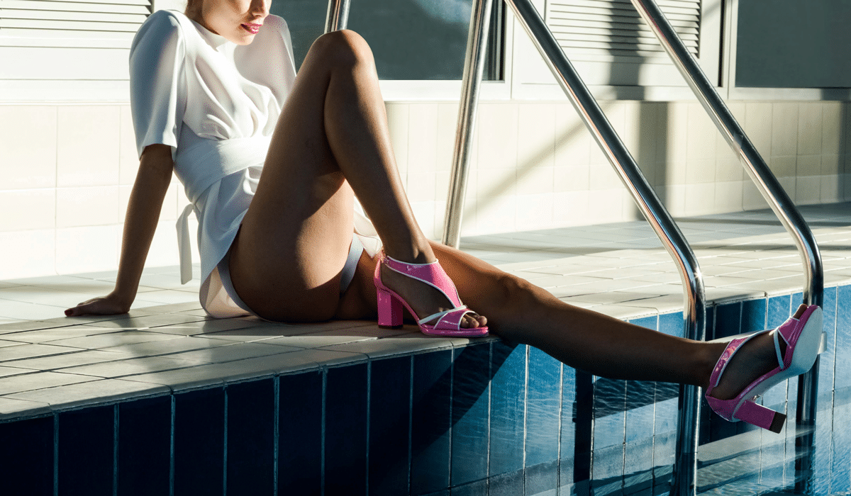
One question came up regularly when creating the interface for Charles Jourdan: How do we embellish and flatter the products (shoes) in photos only? Thanks to the pictures given to us by Charles Jourdan, we were able to illustrate every page with large pictures covering the entire screen, allowing the customer to see the detail and the craftsmanship on every shoe.

Visual creation and Graphic concepts.

Out of all of the visual elements able to influence the client navigation through the website, what typography and what color is going to make them feel what we want them to. How to adjust the size of the items and animate them so that they appear more appealing to a buyer, these are the design choices we make to optimize a website

03

UI design

QUALITY IS UNI-QUE

Creation of visual models and platform prototypes, meanwhile respecting the elements defined by the Charles Jourdan visual style.

Conception of an smooth and elegant interface.

One word stood out and became an important guideline when creating the website: “Dynamic”. Unlike other websites in the market, every interaction you can have on the Charles Jourdan website is accompanied by motion and information movement.

Defining visual interactions

We carefully thought about each interaction on the platform, from the CTA (call to action) color when the user hovers over it or even the orientation of the animation to determine where the user is likely to look and where we should place important information.

Image

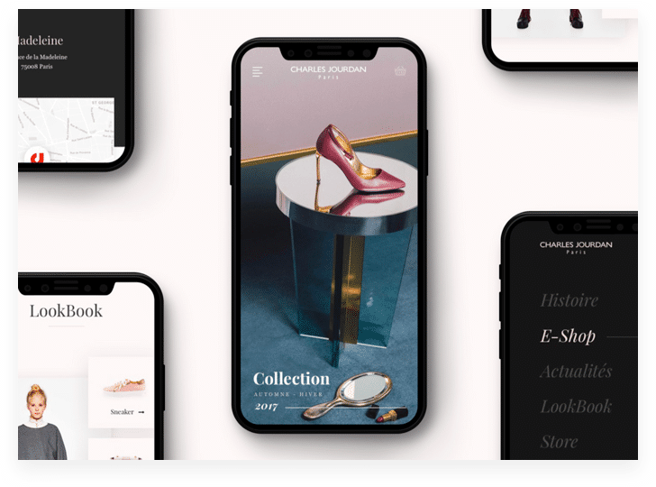
Platform preview and prototype

This last step is the one prior to the source file delivery, it allows Charles Jourdan to have a good look at the final design. Thanks to this prototype the client (C.J) where able to navigate through the website as tho it was already developed, this allows for them to give us notes and perhaps final touches before launch.

03

Results

THE FRUIT OF OUR LABORIOUS COLLABORATION

When the design of the website is done and that the final touches have been applied, we deliver the source file to the client so that it can be handed over to the developers.

Shipping and delivery to the developing teams

The design was approved, yet our work does not stop here. To properly deliver the source files to the developing teams we often must meet them in person so that every detail is understood and utilized resulting in an optimal result.

Documentation and style guide

Not only the models, we also deliver the style guide to the clients. This aforementioned document gathers every interaction and design. It lets the developers know what color scheme to use, the shapes, typography and a lot more crucial information contained in this style guide.

Conclusion

The design finalized, the Charles Jourdan brand can now prepare its development. This step can take many months depending on the complexity of the design and the size of the website. The Charles Jourdan online shop will be available in September 2018.