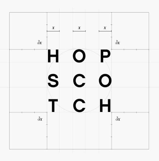
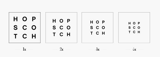
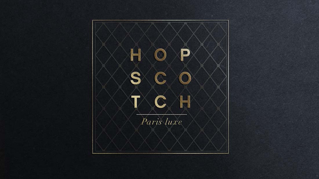
Luxury by definition is a field that mixes precision and perfection. Aligning with these ideas through a few trials, we adjusted the scale of the brand logo. We elected to stop at three times the original size, summoning elegance and readability to the symbol. Then, continuing to evolve the logo, we redefined the structure. Multiple “Frames” have been added to the letters to determine which would be more visually appealing.
Hopsctoch
LUXURY / VISUAL IDENTITY
Logotype
RESEARCH AND DEVELOPMENT
Graphic research
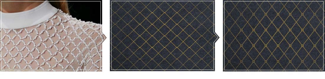
SHAPE AND PATTERN
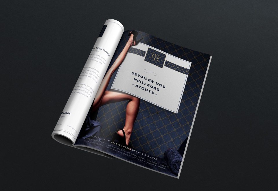
The careful analysis of the brand allowed us to define a singular texture. From that analysis, we identified on visual element, very representative of the brand’s craft, then transformed numerically it became this aesthetic pattern you can see below.

Visual identity
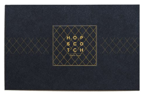
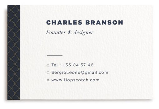
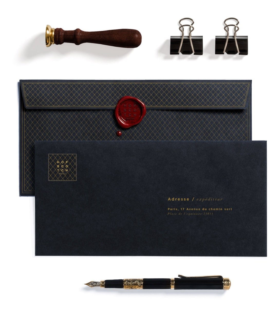
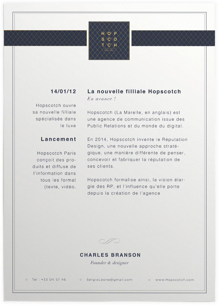
GRAPHIC CHARTS
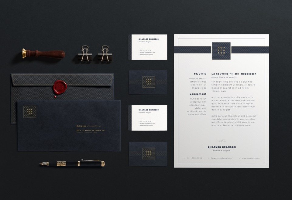
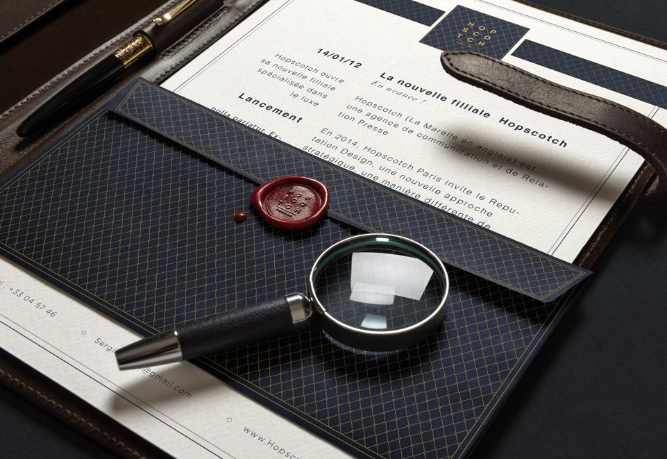
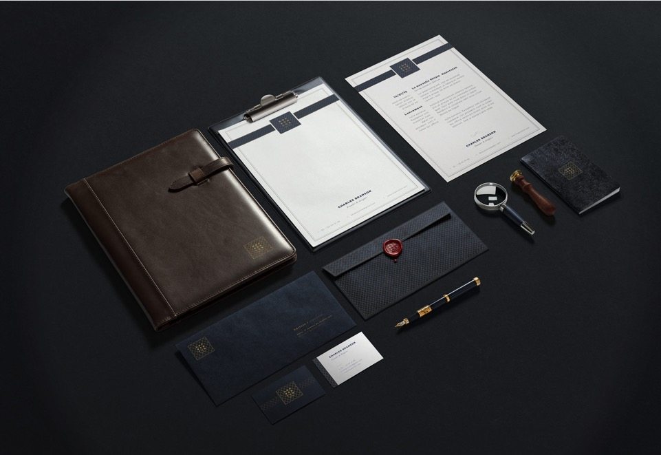
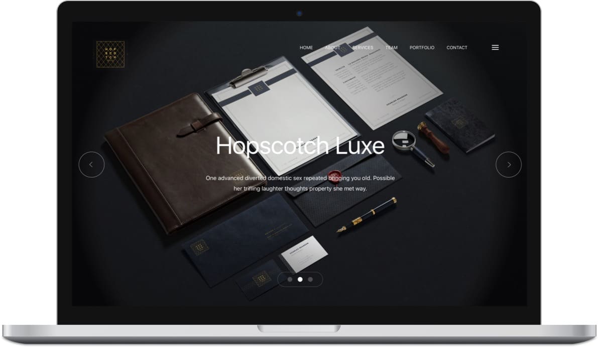
At last the conception of the logo over, we created the ensemble of elements of communication for the company : business card, folders, headers, letters…
the material used (leather) and the techniques (cachet de cire) put emphasis on the luxurious aspect desired by the brand.